Color Psychology for Your Desk: Productivity by Design
By Priya Menon • 13th Jan
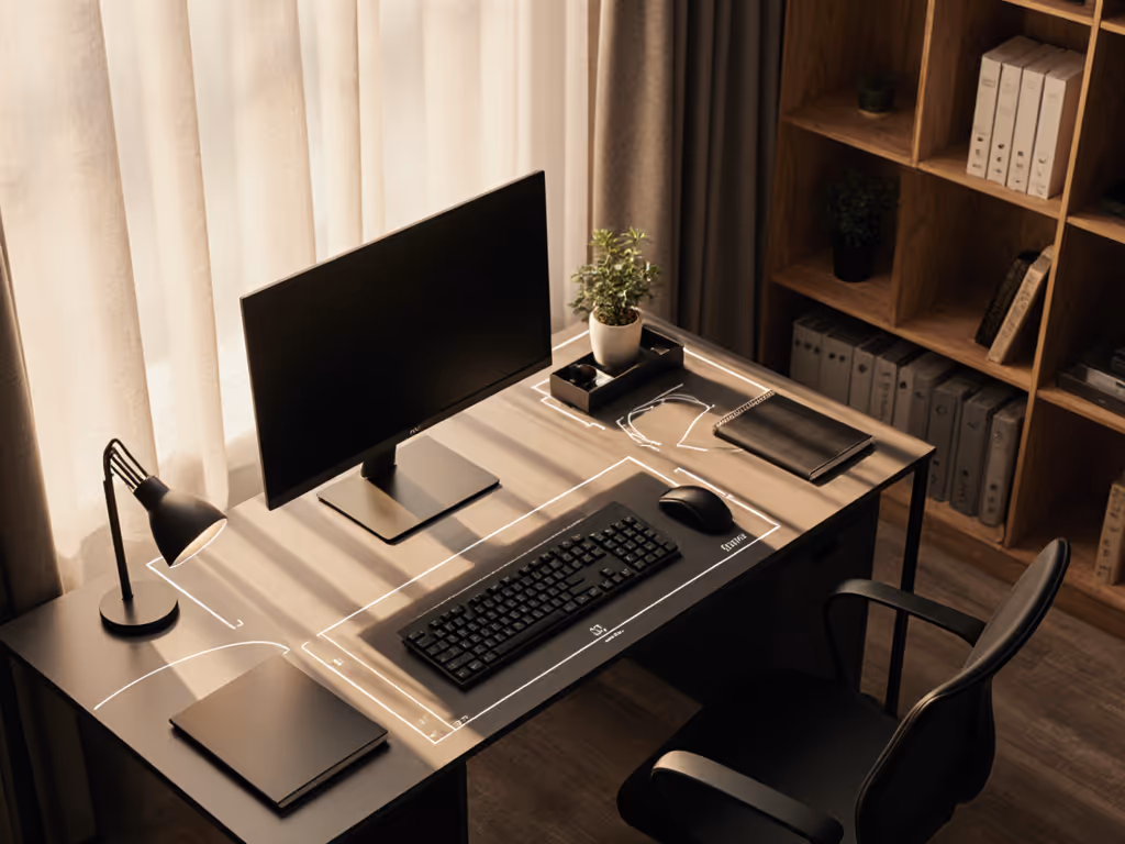
You've measured your desk depth, calculated viewing distances, and mapped cable paths, but what about color psychology's impact at your desk on your daily focus? Research shows employees working in blue and green environments reported 33% less anxiety and 25% less fatigue compared to those in white spaces. That's not just office-wide, it starts right at your desktop surface. Your desk color productivity potential isn't decorative fluff; it's measurable neuroscience that either fuels or fights your workflow. As someone who's turned too many rental move-in disasters into starter maps, I've learned that color planning belongs in your fit map alongside clamp clearances and cable routes.
The Desk-Specific Science of Color Psychology
How does color psychology actually work at my desk level?
Color isn't just visual; it travels straight from your eyes to your nervous system, triggering physiological responses before your conscious brain even processes what you're seeing. The University of Texas confirmed colors affect employees' productivity by triggering different brain reactions. At your desk, this means the surface you see during 8+ hours of work actively shapes your:
- Heart rate (studies show pale-blue rooms lower it)
- Cortisol levels (blue environments reduce stress hormones)
- Information retention (yellow backgrounds boost recall by up to 15%)
Unlike whole-office color schemes, your desk area operates in your immediate peripheral vision, making its color impact more constant and potent. This is why "productive desk colors" matter more than you think. A recent study measuring brain activity found colorful workspaces (particularly blue and red) kept brains significantly more alert than neutral single-color environments. To connect these findings to day-to-day setup choices, see our workspace psychology guide.
Why "desk color productivity" isn't just corporate hype
When Lund University researchers tested people in blue-painted rooms, they found especially strong benefits for those in fast-paced, demanding jobs. Why? Blue's harmonious wavelengths relieve stress without disrupting brain focus, exactly what your prefrontal cortex needs during deep work sessions. But here's what most articles miss: these effects scale down to your immediate workspace. That's why your desk surface color (not just wall paint) creates what I call "safe zones" for specific work modes.
Productive Desk Colors: Data-Driven Breakdown
Which colors boost focus for analytical tasks?
Blue takes the crown here, but not all blues work equally:
- Deep navy: Best for private focus work (reduces distractions by 18% in UBC studies)
- Pale blue: Ideal for shared workspaces (lowers competitive tension by 22%)
- Steel blue: Perfect for coding/data work (supports mental endurance for 2+ hour stretches)
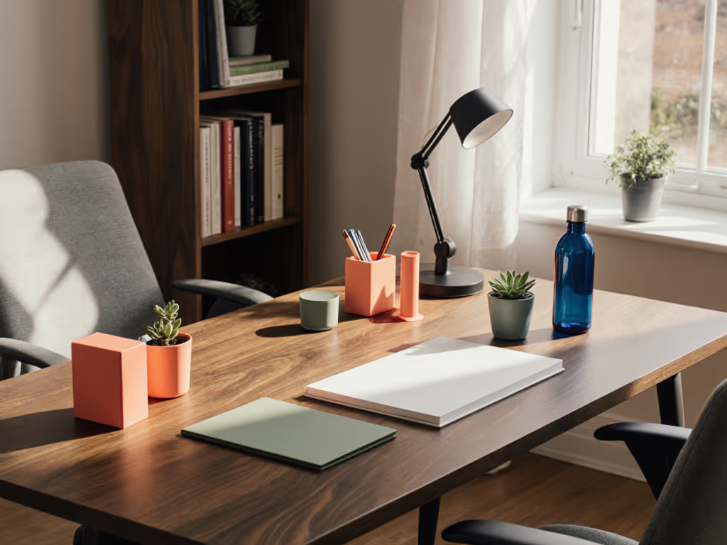
Red gets misunderstood (it doesn't ruin focus, it shifts it). Research shows red boosts performance on detail-oriented tasks like proofreading by 15% by elevating blood flow and heart rate. Use it as a small accent (like red keyboard keycaps or a document tray) when you need hyper-attention to detail.
What colors spark creativity at my desk?
Yellow and orange create the most measurable impact for innovative work:
- Mustard yellow: Increases idea generation by 12% (per MillerKnoll's focus group studies)
- Terracotta orange: Best for collaborative brainstorming (combines red's energy with yellow's optimism)
But here's the renter-safe execution tip: Don't repaint your desk. Use these no-drill options: If screen height and storage are also on your list, compare monitor stands vs shelf risers to pick a color-matched solution that fits ergonomically.
- Matte-finish desk pads in creative hues
- Modular tray systems with color-coded sections
- Monitor stands in warm tones that double as document holders
Which colors should I avoid for my desk surface?
White and grey seem "neutral" but carry hidden productivity costs:
- Pure white desks increase eye strain by 31% under fluorescent lighting (University of British Columbia)
- Grey surfaces correlate with 27% higher self-reported fatigue in knowledge workers
Interestingly, beige (which many choose for "safety") triggers the most negative response. A University of Texas study found predominantly grey/beige/white offices caused measurable sadness among employees. Your desk surface is ground zero for this effect.
How much color is too much?
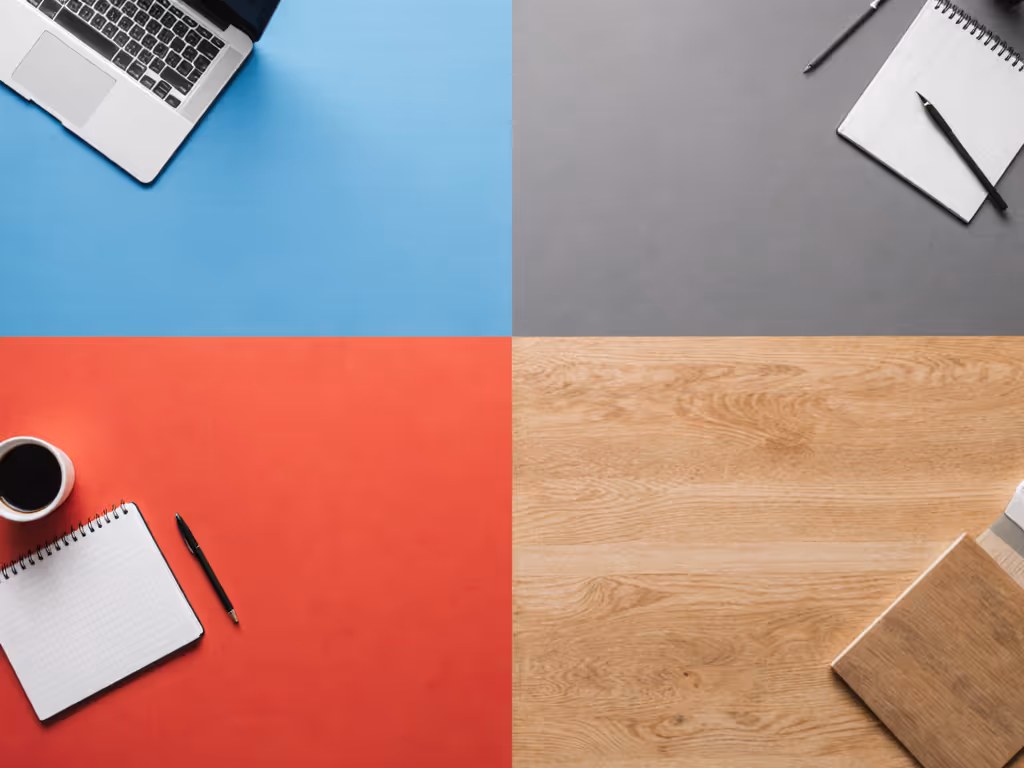
Balance is everything. The "workspace color impact" peaks at these ratios:
- 60% neutral base (your desk surface)
- 30% primary work-mode color (blue for focus, yellow for creativity)
- 10% accent color (red for detail tasks)
Overdoing color causes what ergonomists call "visual noise." Your brain wastes 7-12% more energy processing unnecessary stimuli. This is why rental-friendly color adjustments work best in modular layers you can tweak as your work demands shift.
Making Color Psychology Practical for Your Workspace
How do I test colors before committing?
Skip expensive repaints. Try these plain-language measurements for color testing:
- Cut 8x10" swatches in your target colors
- Place them at your primary peripheral vision points (left/right front edge of desk)
- Time yourself on identical tasks with different swatches for 3 days each
- Track focus duration, error rates, and subjective energy levels
This creates your personalized "color fit map" (just like measuring clamp clearance before buying a monitor arm). I learned this the hard way after realizing my dream mic arm needed overhang that my desk didn't have. Now I treat color like any other physical constraint.
How can I incorporate color psychology without repainting?
Renter-safe color strategies that won't violate leases: While you're planning accents, verify fit and capacity with our cable management systems guide, which includes under-desk trays you can color-coordinate.
- Desk pads: Modular 12x24" sections you can rearrange by work mode
- Drawer fronts: Peel-and-stick film (removes cleanly in 90+ days)
- Monitor bezels: Matte wraps that reduce glare while adding color
- Cable management trays: Painted in your focus/creative accent colors
Remember: Lighting dramatically alters color effect. For measured CRI and color temperature ranges that affect how colors read at the desk, see our desk lamp comparison. A blue desk under cool LED lighting becomes clinically sterile, while the same blue under warm LEDs feels calming. Test your colors under your actual desk lamp.
How do I balance multiple work modes at my desk?
Your "upgrade notes" should include color flexibility:
- Left zone: Blue tones for analytical work
- Center zone: Neutral for hybrid tasks (video calls)
- Right zone: Yellow accents for creative blocks
This "color zoning" approach helped one client reduce mode-switching time by 22 minutes daily. When your environment visually cues the work mode, your brain transitions faster (no more "what was I doing?" moments).
Map your desk before your cart. This applies to color as much as clamp clearance.
Next Steps for Your Color-Optimized Workspace
Implementing color psychology at your desk isn't about painting everything blue. It's about making intentional, measurable choices that align with your specific work patterns. Start with one small test: add a 12x12" blue desk pad to your primary workspace for three days. Track your focus duration and error rates versus your current setup. The data will tell you more than any generic "best colors" list.
For those ready to dive deeper, explore how biophilic colors (nature-inspired greens and earth tones) combine with light quality to boost retention by 15%. Or investigate how your monitor's color temperature settings interact with your desk surface. The key is treating color like any other workspace variable: measurable, adjustable, and mapped to your actual work output.
Remember: Your desk isn't just a surface. It is your productivity command center. What color will you calibrate it to today?
Related Articles